Think your sleek, modern website is compliant with the European Accessibility Act (EAA)? Think again. Even the most polished digital experiences can fall short on essential accessibility features. As the EAA deadline approaches on June 28, 2025, organizations across the EU—and companies selling into the EU—need to ensure their websites are not just visually appealing but also accessible to everyone, including people with disabilities.
Accessibility is not just a “nice-to-have” anymore—it’s a legal obligation. And yet, many businesses are still unaware of the common pitfalls that could render their websites non-compliant. Whether due to oversight, outdated practices, or a lack of technical knowledge, these mistakes could leave you exposed to legal risk, alienate potential users, and ultimately harm your brand reputation.
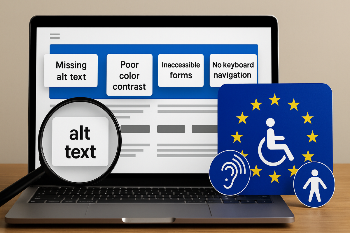
Let’s break down the top five accessibility mistakes that websites make—and how you can avoid them to remain EAA compliant.
1. Missing Alternative (Alt) Text on Images
Alt text might seem like a minor detail, but it plays a critical role in web accessibility. For users with visual impairments who rely on screen readers, alt text provides a spoken description of images, allowing them to understand visual content in a non-visual way.
Unfortunately, missing or poorly written alt text is one of the most widespread accessibility failures on the web. Decorative images that add no informative value should be marked as such (alt=””), but images that convey meaning—like product shots, infographics, or charts—must include descriptive text that communicates their purpose.
When alt text is omitted or vague (e.g., “image1.jpg”), it leaves screen reader users in the dark. That’s more than an inconvenience—it’s a violation of WCAG (Web Content Accessibility Guidelines), which the EAA incorporates.
💡 Tip: As a rule of thumb, ask yourself: “If I couldn’t see this image, would I still understand its role in the content?” If the answer is no, write a concise, accurate alt description.
2. Poor Color Contrast
Design plays a huge part in user experience, but not all beautiful websites are built with accessibility in mind. One of the most common visual barriers is insufficient color contrast between text and background.
Low contrast makes content difficult—or even impossible—to read for users with vision impairments, color blindness, or even just someone looking at a screen in bright light. WCAG 2.1 requires a contrast ratio of at least 4.5:1 for normal text and 3:1 for large text.
This isn’t just about font colors and backgrounds. Links, buttons, and error messages must all be easily distinguishable. Red-on-green text, for example, not only fails the contrast test—it’s also unusable for colorblind users who can’t differentiate those shades.
💡 Tip: Use free tools like WebAIM’s Contrast Checker to evaluate your color palette and ensure every piece of text passes accessibility thresholds.
3. Inaccessible Forms
Forms are where accessibility often breaks down. They’re interactive, complex, and essential—used for everything from newsletter signups to checkout pages. But if your forms can’t be used by someone navigating with a screen reader or keyboard, they’re not accessible.
Common issues include missing labels, unclear instructions, and error messages that don’t explain what went wrong or how to fix it. Even something as basic as a contact form becomes unusable if the fields aren’t properly tagged.
According to EAA regulation, each form field must be associated with a visible label that is also programmatically linked to it. Placeholder text alone is not a sufficient label. Error messages should be announced to assistive technologies and clearly describe the issue—such as “Phone number must include area code”—rather than a vague “Invalid input.”
💡 Tip: Always test your forms without a mouse or trackpad. Can you tab through each field? Is the focus order logical? Are error messages understandable?
4. No Keyboard Navigation Support
Many users with motor disabilities, as well as blind users who rely on screen readers, navigate the web using a keyboard alone. If your website can’t be navigated via the Tab, Enter, and Arrow keys, it’s not EAA compliant—and it’s excluding a sizable portion of users.
Issues often arise when websites use custom components like dropdown menus, modal pop-ups, or sliders that aren’t properly coded to respond to keyboard input. Without thoughtful focus management, users can get “trapped” in one section of the page or be unable to activate certain buttons altogether.
Additionally, visible focus indicators—those outlines that appear around buttons or links when tabbing—should never be disabled. They help users understand where they are on the page and how to move around.
💡 Tip: Try navigating your website using only the keyboard. If you get stuck or confused, so will your users.
5. No Accessibility Statement
Last but not least: even if you’ve made major accessibility improvements, failing to publish an accessibility statement can still leave you short of compliance.
The EAA requires companies to be transparent about the accessibility status of their digital properties. An accessibility statement informs users about the steps you’ve taken to make your site accessible, acknowledges any known limitations, and provides a clear way for users to report issues or request accommodations.
This isn’t just about legal coverage—it’s about building trust with users and showing that accessibility is a priority, not an afterthought.
💡 Tip: Your accessibility statement should be easy to find (often in the footer) and written in plain language. It should include the technologies your site supports, any areas still being improved, and a contact method for feedback.
Final Thoughts
Accessibility is not just about checking boxes—it’s about creating a digital environment that welcomes everyone, regardless of their abilities. And under the European Accessibility Act (EAA), it’s also a legal necessity for many organizations.
Ignoring these five common mistakes—missing alt text, poor color contrast, inaccessible forms, lack of keyboard navigation, and no accessibility statement—could put your organization at risk. But more importantly, it means missing the opportunity to connect with people who want to use your services but physically can’t.
Avoid these mistakes, Request a free EAA accessibility check and get a clear report on what to fix before June 28, 2025.